Symbols iOS: A Retrospective

After I finished my ray tracer back in August last year, I was ready to tackle a new project. This time, I really wanted to make something that I could easily share with friends and family. After thinking about what to do for a few days, I decided to try and make a smartphone game. I hadn’t created a game in ages (I started working on this before making a game for Ludum Dare 47 ) and was eager to see if I still had the chops required to do so.
Brainstorming
I tried to come up with ideas that met some self-imposed constraints I set for this project:
It must be finished in four months or less. Like my previous project, this one shouldn’t take more than 4 months to complete. What kind of game could I possibly make in only 4 months, working a couple of hours in the evening and during the weekends? I had no idea. All I knew was that it needed to be quick and straightforward to implement.
It must be free to download. I was creating this game just for fun. I wasn’t planning to monetize it, so that meant free to download and no IAPs .
I must do everything myself. This meant working only within my capabilities and whatever free assets I could find online. There’s definitely an argument to be made for trying to work within the limits of your own knowledge and skills. For instance, it’s a great way to foster one’s inventiveness and creativity. When you have infinite resources and possibilities, it’s hard to make choices, resulting in overthinking and choice paralysis . Instead, when you embrace your limitations, you learn how to make the best of what you have at your disposal. It’s not easy as it sounds, but it’s a great skill to practice and can be used in every aspect of one’s life.
Easy to pick up and play. The gameplay should be simple enough that the player will be able to understand it without having to read any written tutorial.
After all these considerations, I settled on one of the easiest game genres I know – the puzzle game . Or at least, that’s what I initially thought. Boy, was I wrong! By actually spending some time making one, I quickly learned that creating a genuinely interesting and fun-to-play puzzle game is a real work of art.
Deciding between two ideas
After about a week of brainstorming, I came up with two different and opposite ideas: a falling block puzzle game and a jump rope-themed hyper-casual game . Both sounded interesting on paper, so I needed a way to decide which one to make. In the end, I created a decision matrix to help me understand the strengths and weaknesses of each idea.
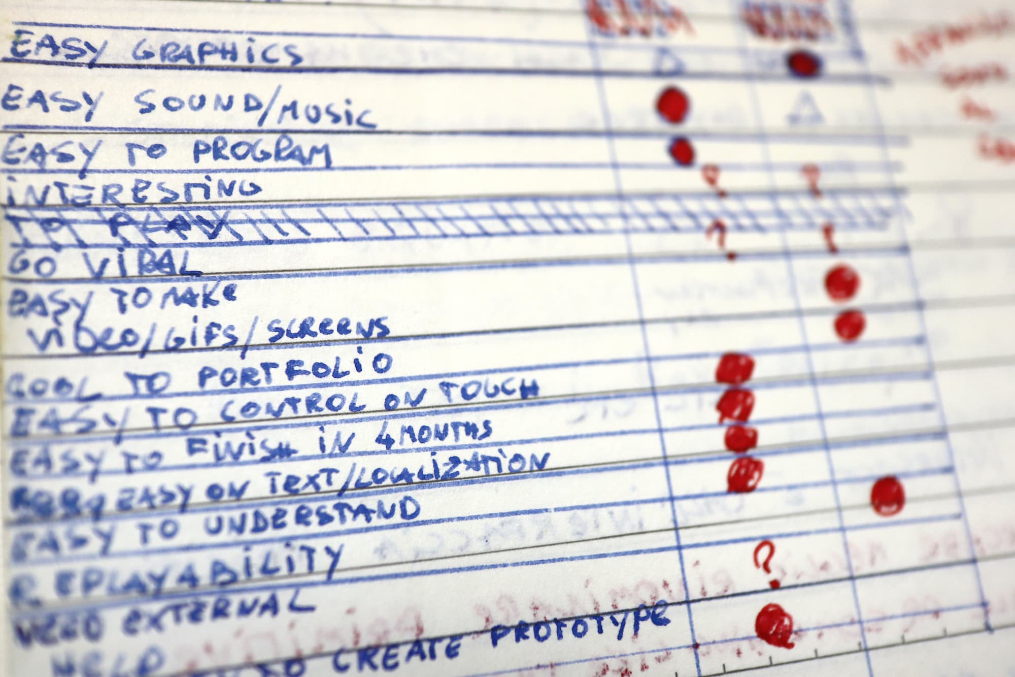
As you can see from the pic above, the hyper-casual game idea beat the puzzle game 7 to 4 on the decision matrix (non-weighted). The hyper-casual game was clearly the winner in terms of ease of creation, implementation, and understandability. The trade-off was that I would have to come up with a somehow attractive graphical style to make it appealing. I also wanted the gameplay to create a synergy with the game music. However, I wasn’t sure if I could possibly do it all (code, graphics, music, etc.) by myself in just 4 months. For this reason, I dropped the hyper-causal game idea and went with the puzzle game one.
Iterations & Prototyping
Now that I had decided on which game to make, it was time to push my idea further.
The game’s first iteration was very simple:
Codename: “Color Puzzle”
Classic falling blocks gameplay a la Tetris .
Each block has a different primary color.
When one block touches another block, their colors blend together. So for instance, if a blue block and a yellow one touch, they will both become green.
The player will clear the blocks by connecting a certain number of blocks of the same color.
Sadly, when I prototyped this idea, I discovered that touch controls aren’t the best for this kind of gameplay.
How could I design the game so that the player’s finger didn’t get in the way?
I started working on the second iteration right away:
Codename: “RGB Puzzle”
Colored dots (inspired by old CRT monitors’ phosphors ) are arranged in a honeycomb pattern.
The dots are grouped into groups of 3. The player can rotate the whole group clockwise by touching it. This idea was born from the need to avoid forcing the player to make overly precise finger movements, as a group of dots has a larger touchable surface than a single dot.
Adjacent dots of the same color will connect.
Every few seconds, a scan line moving from left to right of the playing field will clear all the connected dots.
The game consists of the player trying to connect as many dots as possible before the scan line passes.
The more dots the player clears in a single scan line pass, the more their score increases.
Cleared dots will be replaced with others randomly placed on the playfield.
As the player’s score increases, the scan line gets faster, making the game more challenging.
This iteration ended up not working out because the core mechanic (rotating groups of dots) was confusing and just plain uninteresting.
So, this brings us to the third and final iteration:
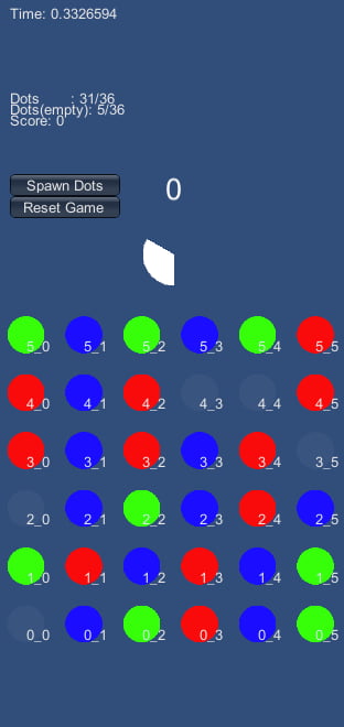
Same dots as the previously-mentioned “RGB Puzzle”, but this time organized in rows and columns.
The playing field is composed of a 6 x 6 grid. I tested various sizes and concluded that anything smaller than 6 x 6 would be too tiny for smaller screen devices.
Instead of sliding dots separately, the player can swipe or flick anywhere on the screen to slide entire columns or rows at a stroke, so there is no need to aim precisely at an exact spot on the screen.
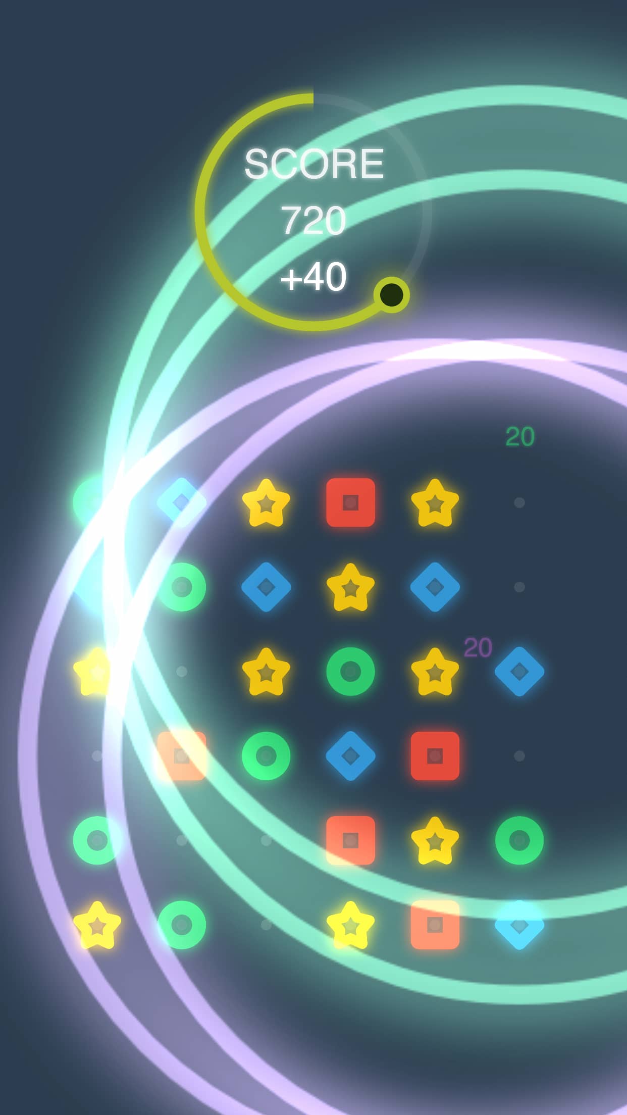
Instead of a scan line, the game has a 60-second timer. When the timer reaches 0, all connected dots get cleared and the player scores points, then some new ones will be randomly dropped on the playfield.
The player loses the game when the playfield is completely filled and there is no more room to drop new dots.
I made a quick prototype and after play-testing it for a while, I decided it was decent enough to turn into a full game.
Aesthetics
Personally, working on a game’s aesthetics and look & feel is one of the most enjoyable things to do (besides coding) for me, so even before the prototype was complete, I had already started working on it.
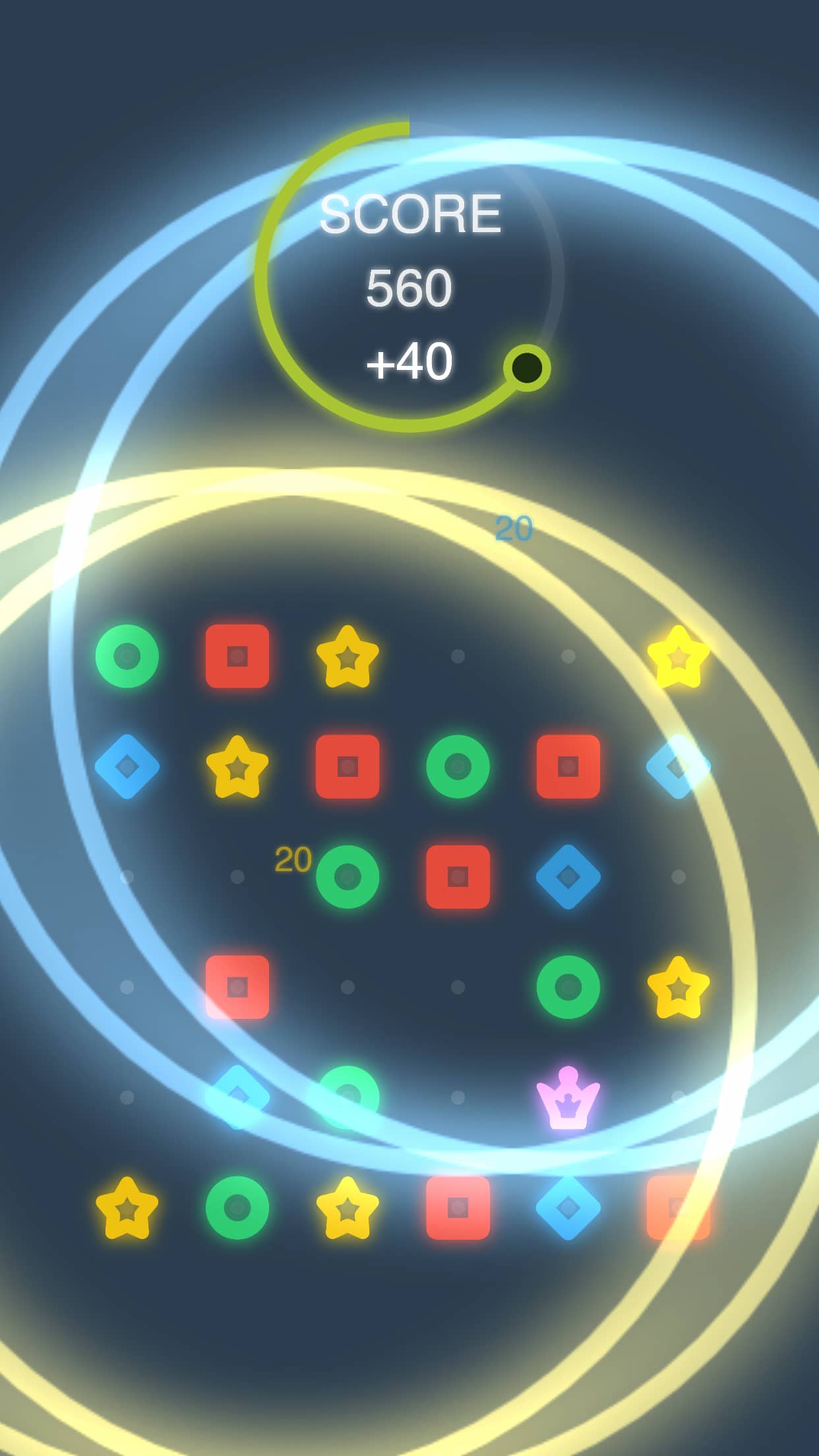
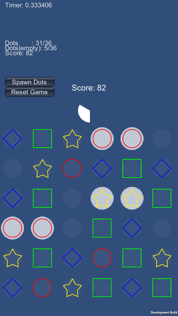
I went for a flat look with big and bold shapes, as most players would be playing the game with their fingers on fairly small screens.
I also made the background a darker solid color to increase the contrast with the foreground and avoid confusing the player.
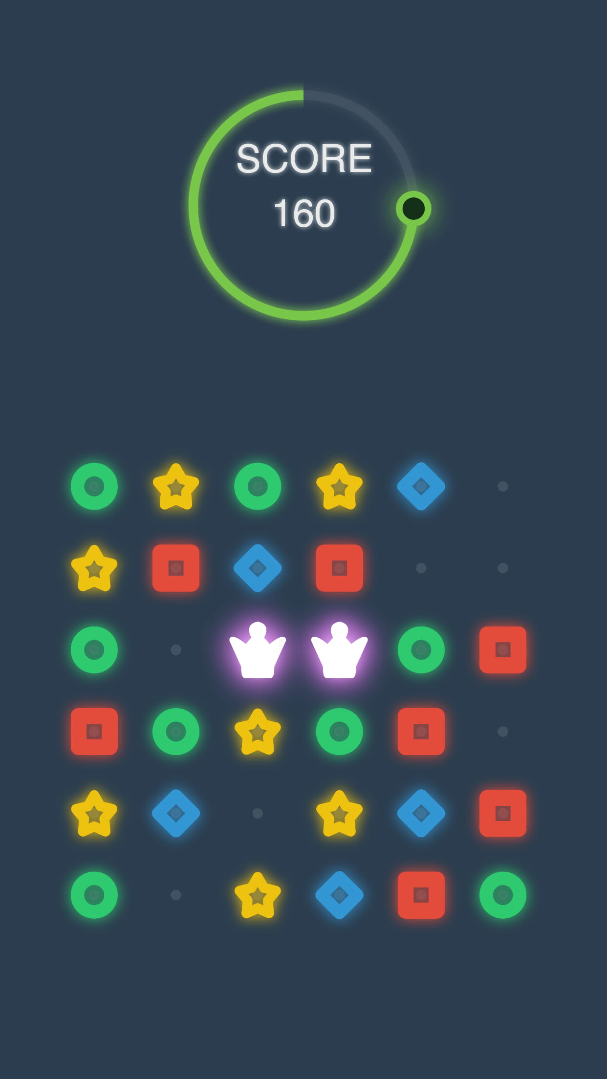
At first, the dots were circle-shaped but shaded with a different color. After testing out the prototype, I realized that using the same circle shape could be confusing, so I changed the dots to various shapes (circle, square, star, etc.) to help the player recognize them more quickly. I also designed the playfield to have some surrounding space instead of making it too close to the edge of the screen, allowing the players to use that space to swipe their fingers without covering the playing area.
Now that the gameplay and graphics were settled, all that was left for me to do was finish the prototype and continue improving it until it became something enjoyable to play.
Lack of Motivation
After the prototype was finally done, I proceeded to work on the game almost every day (except for the weekend I participated in Ludum Dare ).
The project was going smoothly, but around the beginning of November, I started losing motivation and almost ended up giving up altogether. I was having trouble concentrating, and some days I would just skip working on it completely. You could almost say that I was experiencing some degree of burnout .
This wasn’t the first time that something like this happened to me, so I knew exactly what caused it: the difference between how I envisioned this project in my mind vs. how the project was actually developing. In other words, expectation vs. reality. The game’s overall quality was much lower than I had envisioned, so I lost my drive to continue working on the project. What I should have been doing was focusing on finishing the game instead of dreaming about reaching some arbitrary standards that I wasn’t able to achieve.
Almost done
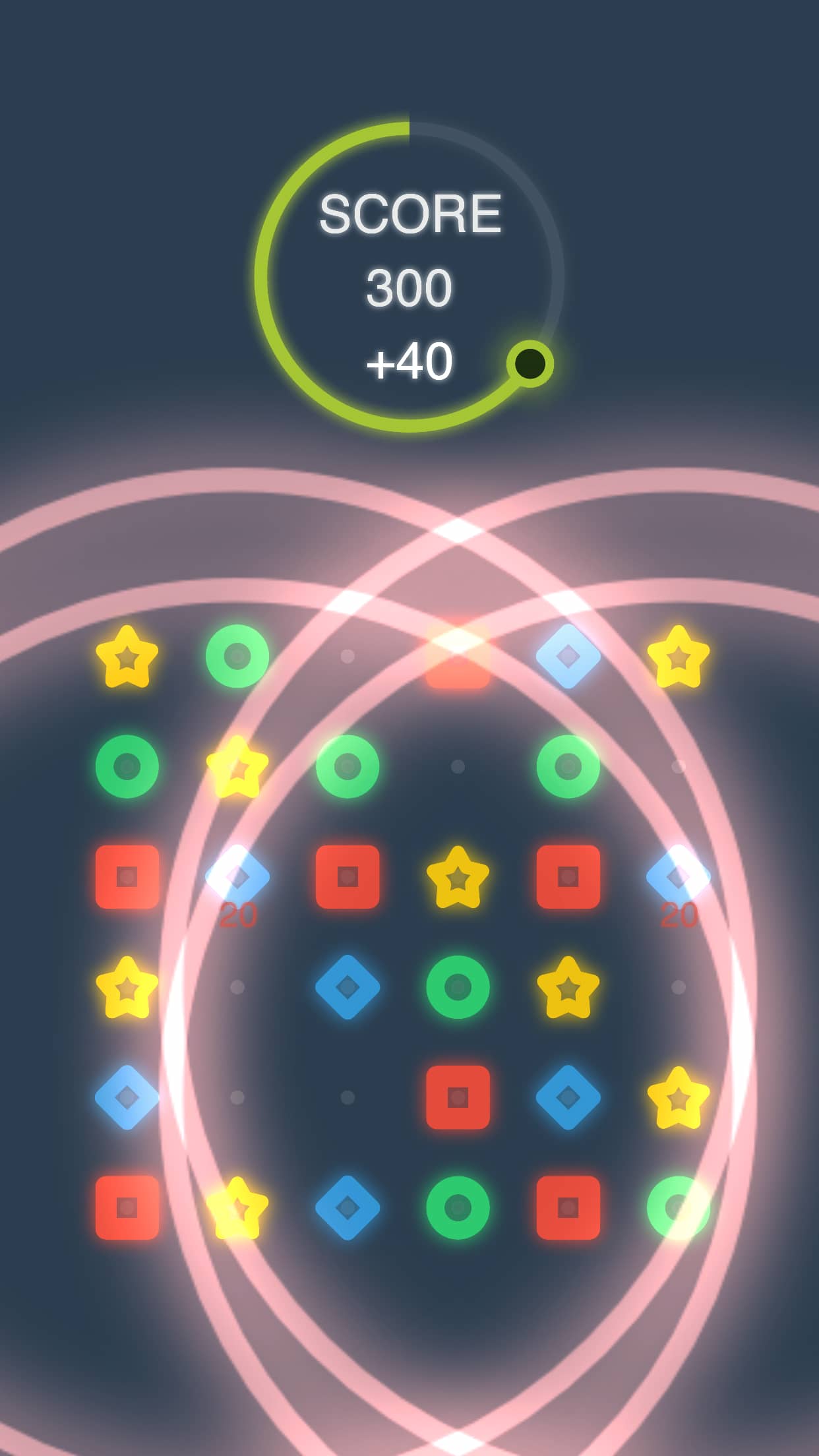
Gradually, I managed to get out of my slump. By the end of November, the core gameplay loop was done and I moved onto menus and music. I hastily finished the game-over screen but wasn’t really thrilled with how it turned out. It looked somewhat cheap and out of place. Oh well – I had only one month left to finish the game, so I didn’t feel too bad about it. Building the tutorial section was quick and easy. Since I’d made the game architecture completely event-driven , all it took was to create a couple of new events to display the interactive step-by-step tutorial and have this interact with the player input to progress through it.
Meanwhile, I started clearing some steps needed to publish the game – namely, renewing my Apple Developer Program membership, which is needed to publish your app on the App Store.
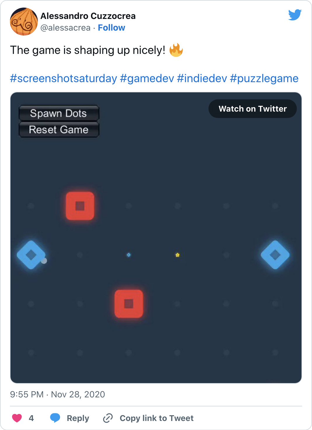
I’m not a big fan of social media – I usually block those sites because they’re productivity black holes – but posting my progress on Twitter ( #screenshotsaturday ) motivated me to keep working on the game. Shout-out to the awesome game dev community on Twitter!
Thanks to this platform, I also connected with another indie creator when a music composer asked me if I needed some tracks for my game. Unfortunately, I had no budget, so I had to politely decline his offer. Still, I was happy that somebody reached out to me, and I would very much love to collaborate with other game developers for my future projects – if I ever manage to get some funding, that is.
Speaking of which, I still had to add the music and sound effects. I had put off working on the audio because it was the one element I couldn’t do myself, so I had to use stock material for this part of the project.
Done
By mid-December, the game was basically complete, from the game loop, and game-over screen to the retry, tutorial, and “fake” splash screen (I use Unity Personal so I couldn’t customize the default splash screen – all I could do was create a second “fake” splash screen and display it right after the default one).
I wanted to hear some feedback, so I sent the beta version to some game dev friends of mine. I should have done this much earlier because this helped me discover a huge flaw in the gameplay. Basically, the game becomes trivial if the player randomly drags their finger aimlessly across the screen instead of carefully planning which points to move. This was a substantial flaw in the game’s core design, but I was running out of time, so I decided to leave it as it was. In hindsight, I should have at least tried to fix the gameplay when I discovered its flaws. Oh well.
It was finally time to prepare the game for the App Store, but I hadn’t decided on the name yet. I had a few ideas in mind but in the end, I went with “Symbols”, which I felt had a nice ring to it.
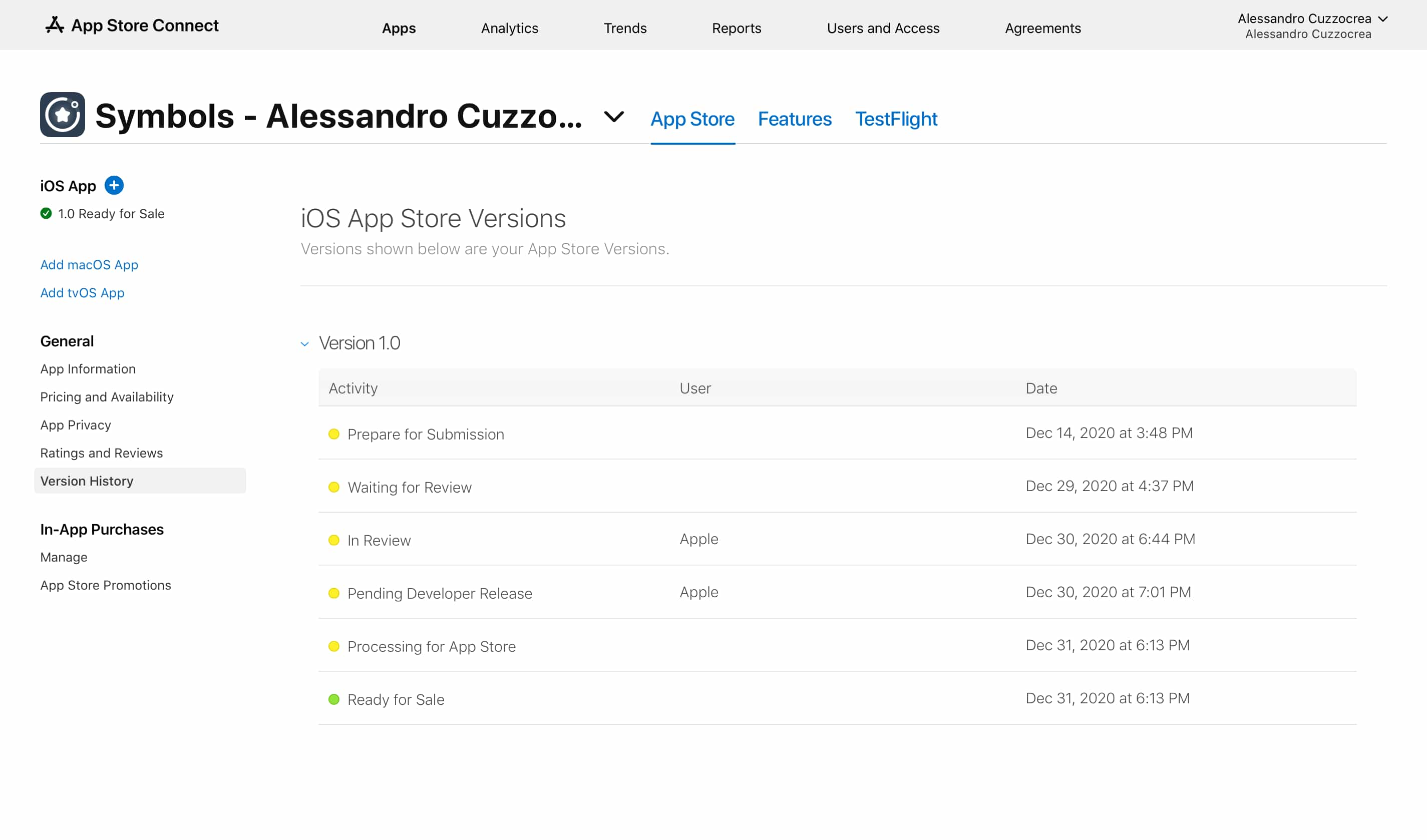
I created a new entry on App Store Connect and finally filled in the App Store name and description along with uploading some screenshots.
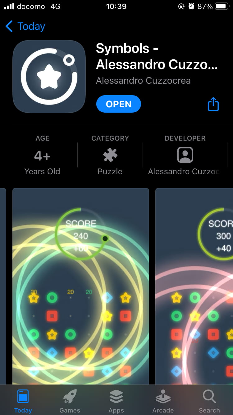
Now I only had one thing left to do: create the final build and upload it to the App Store. I always get nervous when it’s time to submit the final build. What if I mess up? What if I forget something important? What if there’s a critical bug I’ve overlooked? It’s not like the final build is definitive – I can still upload another build or issue an update if something goes wrong – but still, it’s a very sensitive process. I gathered all my courage and proceeded to submit the game to the App Store for review. The review process was pretty fast (it only took 1 day), making the game available for download just in time before the end of the year.
That’s it. The project was finally done.
What do you call that feeling, a mixture of accomplishment and sadness, when you’re about to finish something you’ve been working on for so long? That’s how I was feeling. On one hand, I was happy because the game was complete and ready for players to download and enjoy. On the other hand, I felt sad because I’d been working on the project almost every day for the past 4 months, and finishing it left a small void in my life.
Lessons learned
Making a game is hard work! Motivation alone isn’t enough to get you through the most uninteresting and tedious parts of game development – it also takes strong discipline to make a complete game. Even more so when you’re making a game in a genre you have little personal interest in. From now on, I’m going to focus primarily on my favorite genre: RPG . I’m really glad I learned this lesson from the 4-month project; it would have been awful to find this out after working on a multi-year project.
While brainstorming ideas, I was really on the fence about whether to go with the puzzle game or the hyper-causal game. They seemed like opposite genres, and I felt like I had to pick only one. However, thinking about it now, I should have taken the opportunity to experiment and try mixing the two genres into one game.
Never get too attached to ideas. It’s okay to abandon an idea if it ends up not working as expected after testing. That’s why prototyping is so important – to try out and validate ideas. Unfortunately for this game, I realized the gameplay wasn’t going to work a little too late. I should have spent more time in the prototype phase and ironing out all the problems before moving to the production phase.
Ask around for feedback as early as possible. That said, be aware that your prototype’s look & feel will influence your testers’ feedback. Humans are naturally inclined to judge something pretty more favorably. So, be very careful when showing your prototype, as people will also subconsciously evaluate your game based on something like placeholder assets.
I should learn how to promote my work better. I’m always reluctant to share screenshots and talk about my stuff online. I had this half-idea of creating a trailer and uploading it to YouTube but gave up on it. The game looks better in screenshots than in motion anyway. Either way, having a great trailer is key to marketing your game.
Total Logged Hours
| Category | Duration | % |
|---|---|---|
| Coding | 32:58:48 | 37.44 |
| Prototyping | 29:21:57 | 33.33 |
| Graphics | 9:39:18 | 10.96 |
| Game Design | 7:56:50 | 9.02 |
| Release | 2:45:10 | 3.12 |
| Audio | 2:26:40 | 2.77 |
| Misc | 1:16:13 | 1.44 |
| Playtesting | 1:15:12 | 1.42 |
| Promotion | 0:25:45 | 0.49 |
| TOTAL | 88:05:53 |
Conclusion
All things considered, I think the game turned out kinda okay. Of course, the gameplay is deeply flawed, but it’s just a small practice game that looks decent enough to double as a portfolio piece.
That’s all for now! If you want to try Symbols, it’s available on the App Store . The game is also open-source, with the source code available on GitHub .

2023/06/03 update
In a bit of a twist, Google nudged me about my dev account being on the brink due to mostly unpublished apps.
So to keep it alive, I seized the moment and rolled out Symbols on the Google Play Store , bringing the fun to Android users too. Crisis averted!

Related Articles
 Tearful Heart Retrospective
 Lands of Ambustio: A Retrospective
 Starting out with Godot
 Push Golf and the Unreal Engine 5 Petit Contest: Creating the Game (Part 2)
 Push Golf and the Unreal Engine 5 Petit Contest: From Nostalgia to a Game Jam (Part 1)